
Some of you may have already seen this, but I recently released a Figma Slides template, “Retro Vibes.”
I was inspired by some cookbook covers I’d scoped out at Binding Agents, the cutest little cookbook shop. I mean how could you not be inspired by these?


I put together a Pinterest board of covers for additional inspiration, then popped them into a Figma design file and started color picking from the covers. I arranged the colors into a palette, then started tweaking the various HSL levels so they were more cohesive. This gave me a diverse palette to start experimenting with.

I knew I wanted to use a narrow, condensed serif in the style of old Apple ads, and I was also constrained by using Google Fonts, since I wanted to ensure whatever font I used would be available in the template. (Have I mentioned how happy I am that Figma introduced Google Fonts? So happy.) So, I went through and put together a bunch of different options that I thought could work.
I wanted a font that included an italic option, which narrowed down my search considerably. There’s a ton of good options, but so many of the more interesting fonts just had one style included. Good for a single use case, less good if I’m looking to release a template, where people are going to have a wider array of use cases. I ended up with five potential typefaces:

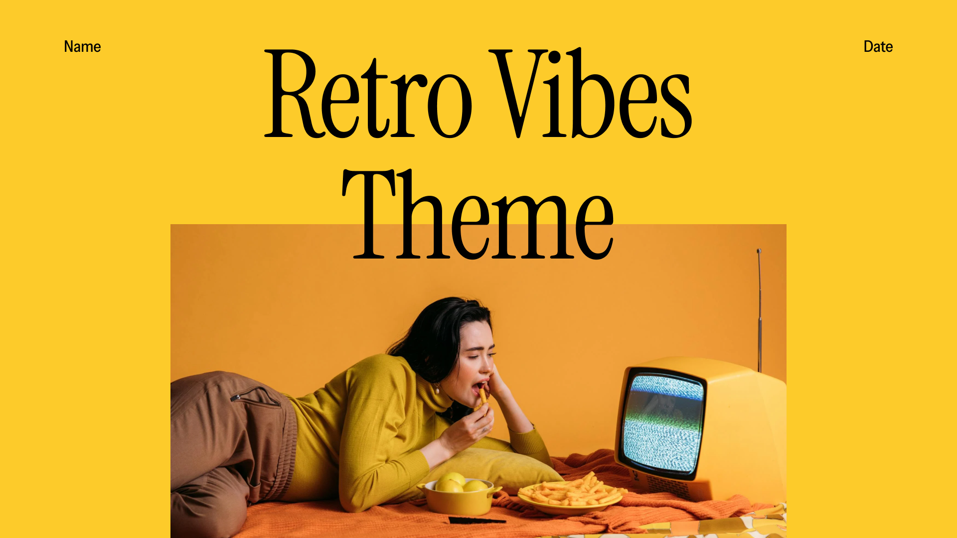
The last element I needed to start really playing around was some imagery. I sourced some retro-looking stock photos from Pexels, focusing on images that would work well with my color palette. I did this concurrently with building out my slides.
After some experimentation and photo gathering, I started narrowing down my color palette to just a few options, cutting out the purples and a few of the various shades of red. I also tried a few font combinations, but Instrument Serif really did fit the original aesthetic I was aiming for best. And, it has an accompanying Instrument Sans, which I was able to use when I wanted to bring a sans-serif typeface in.
Finding the right stock imagery was a challenge, but I tried not to overthink it—the photos would just be there to reinforce the overall theme and would end up being replaced by actual user content.
I also stole some ideas from Figma’s own Mid Mod theme, liking how it approached some of its title slides and section slides.
Then, I just spent a while playing around with different layouts until I ended up with something that felt cohesive and releasable!


You can use this template now for Figma Slides. Give it a try and let me know what you think! And, keep an eye out for more resources coming soon.
Leave a Reply