
![A screenshot of the Classic editor in WordPress, featuring a speaker shortcode. The shortcode reads: [speakers show_avatars="true" speaker_link="permalink" avatar_size="300"].](https://i0.wp.com/melchoyce.design/wp-content/uploads/2018/11/shortcodes.png?resize=1024%2C421&ssl=1)
As part of an effort to add full Gutenberg support to WordCamp.org, I’ve been looking at converting WordCamp shortcodes into Gutenberg blocks.
Project Goals
This project had two goals:
- Make it easier for organizers to add WordCamp-specific content to their sites.
- Review how the community uses the existing shortcodes. For examples, are there any settings we can deprecate or combine with other settings? Is anything missing? Has anyone put together their own “hacks” to make the shortcodes accomplish something they weren’t designed for?
For the sake of scope, I limited the first round to the Organizers, Schedule, Sessions, Speakers, and Sponsors shortcodes.
Process
I started the project with some lo-fi research. I reached out to WordCamp organizers via the Make/Community p2 and asked a small series of questions about their experiences with the shortcode. I was aiming for just enough research to get myself started.
I was happy to receive a great deal of helpful feedback from organizers. There were several comments that led to illuminating conversations about how people customize and curate their WordCamp websites that are very different from how my organizing team sets up our website. I went in with a bunch of assumptions, and while some of them were validated, some of my assumptions were, naturally, not in line with other organizers. This is why having these basic research conversations is so important — even if I didn’t have the time or a longer research process, chatting with other organizers via p2 provided a wonderful array of thoughts and opinions that gave me a better sense of the project.

After I gathered feedback, I started outlining the settings for each existing shortcode in an InVision Freehand. I then started consolidating, removing, and adding any necessary settings. The Freehand was nice because I could throw in a bunch of text along with some super basic sketches. This allowed me to better communicate what I was thinking, and get early feedback from both WordCamp organizers and the developers planning on building the blocks.
After establishing what I thought was a good initial scope, I started mocking up one of the more complicated blocks: Speakers. I decided to go straight into higher-fidelity visual work because the majority of patterns already existed within a Sketch library, which meant putting together a block was quick and easy.
Gutenberg Block Guidelines
Gutenberg blocks have a couple key design principles:
- The primary interface for a block is the content area of the block
- The block toolbar is a secondary place for required options & controls
- The block sidebar should only be used for advanced, tertiary controls
Let’s apply these principles to the Speakers block.
I started with this scope:
- The block is dynamic — it draws content from the Speakers custom post type (CPT) and displays that content on the page.
- While I’d like content to be directly editable via the block, instead of solely through the CPT, that will take a great more effort and is better off being explored in a future version of the block. So, none of the actual content inside the block will be directly editable — just the display of existing content.
- You should be able to select either the entire Speaker list, or individual Speakers.
- Speakers are often announced in posts ahead of time; it would make it easier for organizers to craft these posts if they’re able to select a few speakers to dynamically display via block.
- You need to be able to control the following settings:
- Show or hide avatar, and corresponding size and alignment;
- Show or hide session details;
- Show or hide biography;
- Where their name links to;
- How they’re sorted.
- Personally, I felt that speakers should be able to be arranged in a list, or in a grid. It’s a common design pattern for conferences.
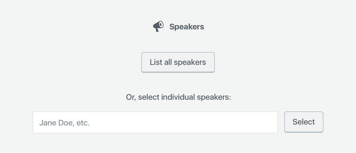
What belongs in the block?
Because the block pulls in dynamic content, the only setup it requires is whether or not it should display all speakers, or individual speakers. This information is necessary to show the block, so it needs to be gathered via a placeholder when you add the block to your page or post.
If you can provide good default content, and that default content is easy to customize, you don’t need to use a placeholder. However, if there isn’t a clear default state that would work for most people, it might make sense to use a placeholder to gather that information.
In the case of Speakers, the smart default could be “List all speakers” — but that block will already be pre-generated on the Speakers page. Thus, the majority of use-cases will probably be on custom pages or posts. It makes sense, in this case, to expose all of the selection options in the placeholder.

That’s all this placeholder needs. Once you select the list of all speakers or an individual speaker, there are no other primary settings required for the block to be correctly configured — it just works.
What belongs in the block toolbar?
Any secondary settings get shown within the block toolbar, with one caveat:
One notable constraint with the block toolbar is that it is icon-based UI, so any controls that live in the block toolbar need to be ones that can effectively be communicated via an icon or icon group.
The Gutenberg Handbook
Within the above scope, the only setting which seems important and can easily be represented is the layout — so, whether Speakers are shown in a list, or in a grid.

Note: the live version will also show the block icon in the leftmost position in the toolbar.
What belongs in the sidebar?
What I’ve designed thus far for the Speakers block is totally usable. You could plop this down into a page or post, publish, and call it a day — no customization required.
However, we have a diverse community with a wide variety of design needs. They might want to customize the block to suit their particular speakers and their WordCamp site design.
That where the sidebar comes in — it houses all of the optional block settings. Because people can close the sidebar, and might never see these settings, they have to be optional.
Think of the sidebar as something that only power users may discover.
The Gutenberg Handbook
These guidelines helped me decide that these settings should be optional:
- Show or hide avatar, and corresponding size and alignment;
- Show or hide session details;
- Show or hide biography;
- Where their name links to;
- How they’re sorted.
I decided to organize them into three panels: photo settings (all the avatar settings), content settings (biography, speaker information, and speaker link), and Sorting and Filtering (sorting like alphabetical, date, etc., along with the number of columns if you’re displaying speakers in a grid).
I also took the liberty of rewriting and regrouping some of the settings to make (what I thought was) more sense. I didn’t just want to copy the shortcode into a block — I wanted to improve on the experience for WordCamp organizers. These particular groupings and names went through lots of iteration.
Iteration
Nothing is perfect on the first try. When I had a block design that felt presentable, I used InVision to turn it into a simple static prototype and presented it to the community. The feedback I received from organizers was vital. How could I succeed without input from the people who are going to use the block?
A bunch of micro-discussions resulted — some focused more broadly on the block, others narrowed on specific features. I did some quick back-and-forth iterations with organizers, posting small mockups to help us communicate. Some of these conversations branched across the various block discussions, so before I published the final mockups, I did a round of consistency updates to make sure the patterns matched on each block.
Result
Once the feedback trickled down and I revised the blocks, I published them all in a post. I’m hoping that once the blocks get built, we’ll be able to get some more feedback from upcoming camps and fine-tune any weird or unexpected behavior.
This project was really fun. It’s been a while since I’ve had time to work on WordPress community projects — I’ve been so focused on the core software lately. And honestly, shortcodes are a terrible experience. I need to constantly try to memorize, or look up (and figure out how to understand!) the various parameters a shortcode takes. Blocks provide a really exciting opportunity to make it way easier to add all kinds of content. I’m already starting to see a ton of cool blocks enter the ecosystem. Maybe I’ll have a chance to write about that next. 😁
Leave a Reply