
I’m working on a demo site for a post I’m writing, using the new Twenty Twenty theme for WordPress. I wanted to try doing a riff on the typical three-column-callout pattern. I liked the options I came up with, and wanted to share them.
You can add these to your WordPress site by downloading the .json files and uploading them into your Reusable Blocks page in your site admin, located at /wp-admin/edit.php?post_type=wp_block. Then, you can find them in your block library under the “Reusable” category. When you add them to your content, you can make them single-use by clicking the ••• menu in your block toolbar, and selecting “Convert to Regular Block.”
Note: To match the designs you see below, you’ll need to be running WordPress 5.3 or later, the Twenty Twenty theme, and ideally, the CoBlocks plugin.
Option 1


Pretty straightforward — 2/3rds primary CTA, 1/3rd secondary CTAs stacked, wide-width. I’ve used an icon here from CoBlocks to add some emphasis to the primary CTA, but you could forego if you have a lot of text, or even use an image. A circular image like a headshot would work well here.
Option 2


Similar to the first option, but left-aligned instead of centered, shorter, and full-width. The secondary CTAs are further de-emphasized by using links instead of buttons.
Option 3


This layout plays with having an offset right column, which I’ve accomplished with a spacer block. You might need to tweak the height of the space to get it to work on your site. The left column is effective because the image is transparent, so it blends in well without edges. Any transparent image, or image where the background matches the background you choose, would work here. This could also easily be a square image, middle column, and the only one row in the right column. The layout is wide-width but could easily be full-width if you wanted, depending on your site’s background color.
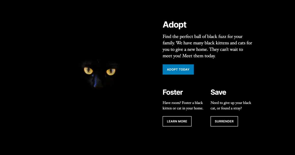
Option 4


Another full-width layout, this one black. Like the above layout, it’s effective because the image’s background is also black, so it blends in. Instead of multiple text columns, this uses a large row and two smaller columns in the row beneath.
Any other layouts y’all would like to see explored?
Leave a Reply