Okay I’ll admit it: I got disproportionately excited when I saw Figma announce their new Sites product. I’m a web nerd. I love making websites, and I love working in Figma. Could this have the potential to be the best of both worlds for me?
Well, it’s still in beta. It has known accessibility issues, and its CMS functionality is still in development. So for now, its wider usage is limited. BUT, that doesn’t mean I can’t geek out and have some fun :)
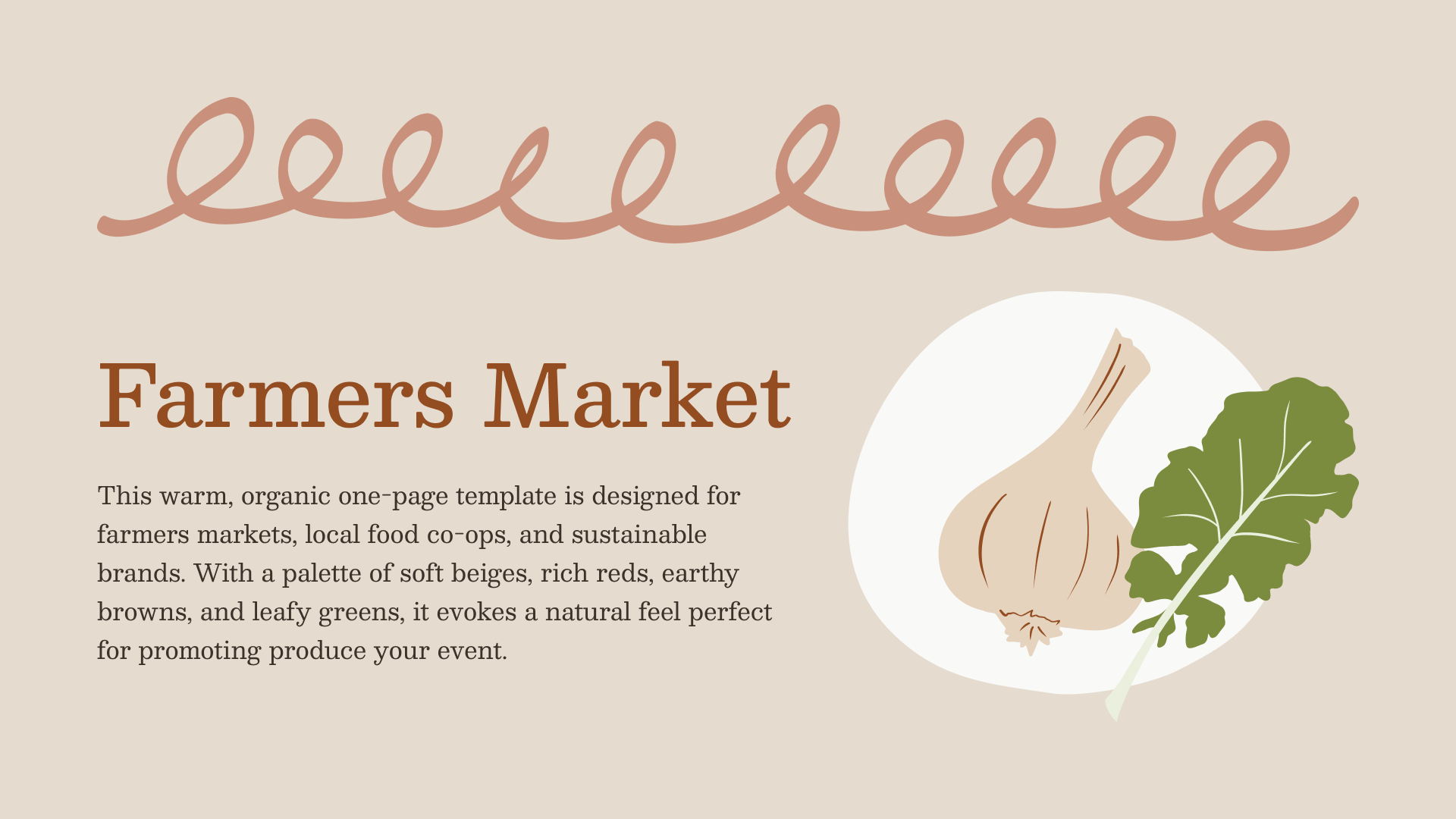
My last team before leaving Automattic was focused on creating new themes and patterns for the WordPress site editor. I did dozens of little concept thumbnails that never made it beyond Figma. I tapped into that collection for inspiration, grabbing this thumbnail I’d liked but never had the opportunity to refine further.

I wanted to keep it limited to just one page, only using static (instead of dynamically updated) content. So I included date/time, location, a list of vendors, and a blurb about the market.
I aimed for the design to feel organic and crafty. I tried combining stock photography with this free shape library, but didn’t love how they felt together. Instead, I started working on some illustrations I could include. I drafted some ideas in Procreate, then struggled with vectorizing them. I wanted the kind of texture and character you can get from raster art that just doesn’t translate as well in vector art. Live tracing the drawings in Illustrator just wasn’t working out how I wanted. So, I tried redrawing in Adobe Fresco, which was…fine. It would be cool to do illustrations directly in Figma, but for now, my digital drawing capabilities are limited to my iPad.
Once I felt like I had a decent draft, I copied it into Figma Sites and started figuring out how to actually build it.
The interface for Sites is, unsurprisingly, just Figma in a different context. The page control in the left sidebar is for website pages, not document pages. The file information panel at the top of the sidebar contains a “publish” button. The righthand design/prototype toolbar is the same. Overall, it feels like a natural progression to the Figma interface. The only feature that feels new is the way you design responsively.

I’m unsure if it automatically maps which screen size to use for your imported mockup or if it just defaults to desktop, but it’s dropped as a size-specific artboard into a page canvas. (I have no idea if I’m using the official terminology, fyi.) From there, you can click the “+” in the corner of the canvas to add different screen sizes. It offers some preset sizes, or lets you create a custom breakpoint. And that’s what this is doing—each artboard is acting as a breakpoint for design changes.
This is where intimately knowing how Autolayout works is key. Whether or not something is a fixed size or responsive depends on the autolayout setting for that element, and that element’s parent, etc. etc. So if like me you’d been playing around, you’ll have a lot of cleanup to do in order for your site to work as expected.
This means using width: fill with max-widths, properly setting up columns and rows, and making sure the correct elements or containers have padding. And, it means ensuring any images or vectors you include are either ratio locked or unlocked to allow for your intended scaling.
I found myself using the preview feature a lot and resizing the pane to check if my layout was responding as I intended. Unlike a design prototype, the preview opens in the same file. I kept forgetting and being like “wait where’d my site file go,” so I think that’ll take more getting used to 😂
When you make a change to your design, it cascades down. For example, making a content or color change to your biggest desktop artboard will be reflected on smaller screens. If you want that to be overridden at a smaller size, you can do so, and that change won’t cascade back up. As I was fiddling I ended up having to redo a few things, but now that I have the hang of it I suspect my next project will go smoothly.
One thing that tripped me up in another template I’m designing is that you can’t create new components inside of a page canvas. You have to drag it outside of that canvas in order to convert it into a component, so I ended up making a floating artboard to hold my components.
Publishing the site was easy—it creates a new figma site URL on the fly you can access. If you’ve ever had a GitHub PR create an automatic preview, it’s similar to that. You can use that URL if, like me, you’re just creating something that doesn’t need to be branded. But, if you want to use it with a custom domain, that’s already supported. (I didn’t go through that setup flow because I didn’t need to.)
And, when you’re publishing, it will also scan your site for potential issues.


If you’d like to take my site for a spin or download it and poke around yourself, I’ve made both the live site and the Figma file available:
This design is licensed under CC BY-SA 4.0. This means you’re free to share, reuse, and adapt it as you see fit for both personal and commercial uses, as long as you credit me somewhere.
(You are free to use the template to build websites for clients, but the only thing I ask is that you don’t sell the template itself or the illustrations included without making your own improvements, because that’s kind of a jerk move.)
Hope you enjoy! I plan on making a few more Figma Site templates for public use, and I’m hoping once it’s out of beta I’ll be able to upload it to the community. But in the meantime, you’ll find any new templates I release on my blog.
Let me know what you think!


