• Creating a simple block pattern plugin for the Gutenberg editor

    Creating a simple block pattern plugin for the Gutenberg editor

    Gutenberg has the potential to be an extremely powerful site building tool. Each release brings it closer and closer to full site editing. Imagine being able to rearrange your header, add a sidebar, or combine different layouts inside your footer without needing to rely on your theme to provide multiple options.

    Part of this new vision for WordPress includes block patterns, which are combinations of blocks you can create and share to help people make rich, unique site layouts. The possibilities are exciting. Many third-party plugins already provide these feature, so I’m stoked to see them being included in the core editing experience.

    Gutenberg 7.8 introduced a new (WIP, subject to change) API to register custom block patterns:

    register_pattern(
        'my-plugin/my-awesome-pattern',
        array(
            'title'   => __( 'Two buttons', 'my-plugin' ),
            'content' => "<!-- wp:buttons {\"align\":\"center\"} -->\n<div class=\"wp-block-buttons aligncenter\"><!-- wp:button {\"backgroundColor\":\"very-dark-gray\",\"borderRadius\":0} -->\n<div class=\"wp-block-button\"><a class=\"wp-block-button__link has-background has-very-dark-gray-background-color no-border-radius\">" . esc_html__( 'Button One', 'my-plugin' ) . "</a></div>\n<!-- /wp:button -->\n\n<!-- wp:button {\"textColor\":\"very-dark-gray\",\"borderRadius\":0,\"className\":\"is-style-outline\"} -->\n<div class=\"wp-block-button is-style-outline\"><a class=\"wp-block-button__link has-text-color has-very-dark-gray-color no-border-radius\">" . esc_html__( 'Button Two', 'my-plugin' ) . "</a></div>\n<!-- /wp:button --></div>\n<!-- /wp:buttons -->",
        )
    );

    It really only contains two things: a name for your pattern, and the raw HTML output that you can copy and paste from the Code editor view. This means you can design your patterns straight in the editor, no coding knowledge required.

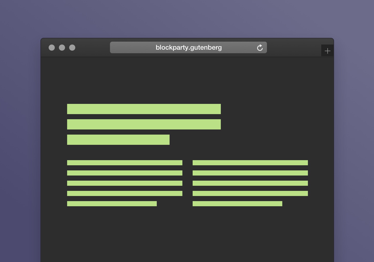
    When you add a new pattern to your site, they show up in a new sidebar in your editor:

    The new (temporary) patterns sidebar. See more designs on GitHub.

    Let’s look at making a new pattern.

    I want to create a simple text pattern that contains a larger introductory paragraph, and two columns of paragraphs below.

    The first thing I do is add a new column block to the editor:

    I want the intro paragraph to be a little wider than the two paragraphs I’m going to put below it, so I choose the 70/30 option.

    I enter my first paragraph, and increase the font size to 28px. I leave the second column blank.

    Now, I add another column block, this time choosing the 50/50 option, and add my two paragraphs.

    That looks good. Let’s go over to the Code view and grab that raw HTML:

    Escape it, and then plop it inside register_pattern:

    register_pattern(
        'mels-gutenberg-block-patterns/intro-two-columns',
        array(
            'title'   => __( 'Intro paragraph with two columns', 'mels-gutenberg-block-patterns' ),
            'content' => "<!-- wp:columns -->\n<div class=\"wp-block-columns\"><!-- wp:column {\"width\":70} -->\n<div class=\"wp-block-column\" style=\"flex-basis:80%\"><!-- wp:paragraph {\"customFontSize\":28} -->\n<p style=\"font-size:28px\">Driving empathy maps and possibly surprise and delight. Target mobile-first design with the aim to build ROI.</p>\n<!-- /wp:paragraph --></div>\n<!-- /wp:column -->\n\n<!-- wp:column {\"width\":33.33} -->\n<div class=\"wp-block-column\" style=\"flex-basis:33.33%\"></div>\n<!-- /wp:column --></div>\n<!-- /wp:columns -->\n\n<!-- wp:columns -->\n<div class=\"wp-block-columns\"><!-- wp:column -->\n<div class=\"wp-block-column\"><!-- wp:paragraph -->\n<p>Informing innovation and then surprise and delight. Driving custom solutions and possibly think outside the box. Create awareness with a goal to funnel users. Lead relevant and engaging content with the possibility to infiltrate new markets.</p>\n<!-- /wp:paragraph --></div>\n<!-- /wp:column -->\n\n<!-- wp:column -->\n<div class=\"wp-block-column\"><!-- wp:paragraph -->\n<p>Amplifying innovation with the possibility to target the low hanging fruit. Consider dark social but innovate. Creating a holistic approach in order to be on brand. Leading empathy maps but be CMSable. Repurposing branding.</p>\n<!-- /wp:paragraph --></div>\n<!-- /wp:column --></div>\n<!-- /wp:columns -->",
        )
    );

    (I’ve used onlinestringtools.com to escape the raw html output, but there are also code editor tools that can do this.)

    Then, we can wrap our registered pattern in a plugin:

    <?php
    /**
     * Plugin Name: Mel's Super Rad Patterns
     * Description: A simple plugin to demonstrate how to add Block Patterns to Gutenberg.
     * Version: 1.0
     * Author: Mel Choyce
     */
    
    /**
     * Register Custom Block Styles
     */
    function mels_patterns_register_block_patterns() {
        if ( function_exists( 'register_pattern' ) ) {
        /**
        * Register block patterns
        */
            register_pattern(
                'mels-gutenberg-block-patterns/intro-two-columns',
                array(
                    'title'   => __( 'Intro paragraph with two columns', 'mels-gutenberg-block-patterns' ),
                    'content' => "<!-- wp:columns -->\n<div class=\"wp-block-columns\"><!-- wp:column {\"width\":70} -->\n<div class=\"wp-block-column\" style=\"flex-basis:80%\"><!-- wp:paragraph {\"customFontSize\":28} -->\n<p style=\"font-size:28px\">Driving empathy maps and possibly surprise and delight. Target mobile-first design with the aim to build ROI.</p>\n<!-- /wp:paragraph --></div>\n<!-- /wp:column -->\n\n<!-- wp:column {\"width\":33.33} -->\n<div class=\"wp-block-column\" style=\"flex-basis:33.33%\"></div>\n<!-- /wp:column --></div>\n<!-- /wp:columns -->\n\n<!-- wp:columns -->\n<div class=\"wp-block-columns\"><!-- wp:column -->\n<div class=\"wp-block-column\"><!-- wp:paragraph -->\n<p>Informing innovation and then surprise and delight. Driving custom solutions and possibly think outside the box. Create awareness with a goal to funnel users. Lead relevant and engaging content with the possibility to infiltrate new markets.</p>\n<!-- /wp:paragraph --></div>\n<!-- /wp:column -->\n\n<!-- wp:column -->\n<div class=\"wp-block-column\"><!-- wp:paragraph -->\n<p>Amplifying innovation with the possibility to target the low hanging fruit. Consider dark social but innovate. Creating a holistic approach in order to be on brand. Leading empathy maps but be CMSable. Repurposing branding.</p>\n<!-- /wp:paragraph --></div>\n<!-- /wp:column --></div>\n<!-- /wp:columns -->",
                )
            );
        }
    }
    add_action( 'init', 'mels_patterns_register_block_patterns' );

    …And now our new pattern shows up in the sidebar inside Gutenberg:

    Whoo! 🎉 Party time 🕺


    The possibilities are pretty endless. You can stick with simpler patterns, or combine even more blocks and patterns to create rich, complex layouts:

    Want to learn more about combining blocks to make unique designs in WordPress? Attend WPBlockTalk, this upcoming Thursday. It’s free and online, so you can watch from anywhere!
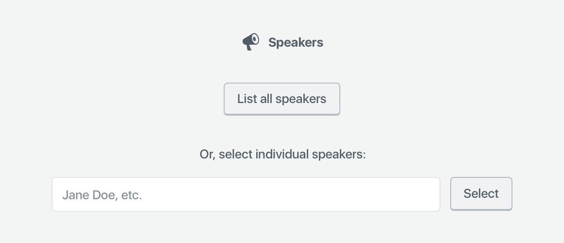
  • Adding block dependencies to themes

    Adding block dependencies to themes

    When I was working on the designs for the new WordPress Block Directory, I thought a bit about how it could be integrated with themes, which currently don’t allow inclusion of blocks and plugins (for good reason — it would suck to lose content on theme switch!). With some careful planning, I think we could safely introduce block dependencies into themes. Here’s what I’m thinking.

    Themes can specify blocks.

    When creating a theme, you can specify specific blocks from the Block Directory to include with your theme. These could be blocks you’ve written, or other blocks you’ve accounted for in your theme styles.

    Activate blocks on theme activation.

    When someone activates (not installs) your theme, WordPress can silently download the blocks from the Block Directory.

    Delete unused blocks on theme switch

    If someone is trying out a bunch of themes, and each of those theme includes block dependencies, we don’t want to install a dozen or more blocks someone might not use. If someone switches to a new theme without using included blocks, WordPress could silently delete them from the site, just as it silently installed them.

    Keep used blocks on theme switch

    If you’ve used any of the blocks a theme provides, they remain installed and activated when you switch themes.

    Third party blocks = third party dependency management

    If the blocks you’re including aren’t in one of the Block Directory, you’ll need to rely on a third party dependency management system, similar to TGM.


    How does this sound? As a theme author, would you like to see a dependencies system like this?

  • Four Gutenberg column layouts for the Twenty Twenty theme

    Four Gutenberg column layouts for the Twenty Twenty theme

    I’m working on a demo site for a post I’m writing, using the new Twenty Twenty theme for WordPress. I wanted to try doing a riff on the typical three-column-callout pattern. I liked the options I came up with, and wanted to share them.

    You can add these to your WordPress site by downloading the .json files and uploading them into your Reusable Blocks page in your site admin, located at /wp-admin/edit.php?post_type=wp_block. Then, you can find them in your block library under the “Reusable” category. When you add them to your content, you can make them single-use by clicking the ••• menu in your block toolbar, and selecting “Convert to Regular Block.”

    Note: To match the designs you see below, you’ll need to be running WordPress 5.3 or later, the Twenty Twenty theme, and ideally, the CoBlocks plugin.


    Option 1

    Pretty straightforward — 2/3rds primary CTA, 1/3rd secondary CTAs stacked, wide-width. I’ve used an icon here from CoBlocks to add some emphasis to the primary CTA, but you could forego if you have a lot of text, or even use an image. A circular image like a headshot would work well here.


    Option 2

    Similar to the first option, but left-aligned instead of centered, shorter, and full-width. The secondary CTAs are further de-emphasized by using links instead of buttons.


    Option 3

    This layout plays with having an offset right column, which I’ve accomplished with a spacer block. You might need to tweak the height of the space to get it to work on your site. The left column is effective because the image is transparent, so it blends in well without edges. Any transparent image, or image where the background matches the background you choose, would work here. This could also easily be a square image, middle column, and the only one row in the right column. The layout is wide-width but could easily be full-width if you wanted, depending on your site’s background color.


    Option 4

    Another full-width layout, this one black. Like the above layout, it’s effective because the image’s background is also black, so it blends in. Instead of multiple text columns, this uses a large row and two smaller columns in the row beneath.


    Any other layouts y’all would like to see explored?

  • Gutenberg Navigation Block Concepts Roundup

    One of the goals for Gutenberg Phase 2 is a new navigation menu block. There’s already been a lot of thought and discussion on this, which I wanted to gather into one location so it’s easier to review and compare all the options.

    Early concepts

    There are a number of early explorations on the GitHub thread:


    WordCamp US contributor day

    At the WordCamp US contributor day, a group got together and started thinking through a navigation block:


    Individual explorations

    Brent Jett has been writing a good series on the future of themes and customization in Gutenberg, and the second part of his series covers navigation:

    I have a couple more early ideas kickin’ around that I need to update:

    Did I miss any?

  • Designing a “Restaurant Menu” Block

    An animation showing the transition between a selected block, with toolbar and "add" icon, and a deselected block. The block contains a heading that says "Appetizers," and lists four menu items along with their price and description.

    Download Sketch file.

    View InVision prototype.


    I’ve wanted a better way of making restaurant menus since first working on WordPress.com’s restaurant menu custom post type a couple years ago. The process felt so slow, clunky, and divorced from the final product. CPTs never felt like the right method for providing this kind of content. Blocks provide a perfect opportunity to redesign how we add restaurant menus to our a site —  they’re UI-first, and both edited and previewed in-context.

    What the best way to approach this kind of block? If I were to convert the WordPress.com restaurant CPT 1:1, it would look like:

    • A parent block to act as a container.
    • Child blocks for menu sections, featuring names and descriptions.
    • Child blocks within menu sections for menu items, featuring a placeholder for featured image, name, price, and description.
    • Custom taxonomies (“menu labels”) for menu items.

    That seems like a whole lot of overhead for some content that, let’s be honest, doesn’t change very often. In many cases, the most a menu is changed is seasonally. I think we can ease the setup and maintenance of the block quite a bit.

    Zooming In

    Let’s look at simplifying restaurant menus down to their basic element: menu items. What if the only restaurant block that exists was a menu item?

    Menu item on the top left, price on the top right, and description below were the most common pattern I found when reviewing restaurant menus.

    Pros

    • Super simple — only need to enter three lines of text.
    • Minimal settings. Bold and italic options for some minimal text formatting control, but otherwise, no sidebar options.

    Cons

    • You have to add a new block for every menu item, which will get tedious fast.
    • Because menu items aren’t grouped into a shared container, styling options for your menu are limited.
    • Doesn’t make sense to be able to add menu items everywhere.

    These cons seem pretty big; let’s widen the scope.

    Zooming Out

    The next level above a menu item is a menu section. This is a parent container that features a section title, and individual menu items as children.

    Heading and Menu Item contained within the same container block.

    Pros

    • A wrapper means the entire section can be targeted with custom CSS, or support layout options.
    • The block could default to adding a new menu item next, so all you need to do to get another item is press “enter” at the end of the description field.
    • The block is still relatively simple, compared to the original.

    Cons

    • Doesn’t support the complex scenarios that the original CPT supports, including taxonomies and featured images.

    This feels like a happy middle-ground between the existing CPT, and a completely zoomed-in version of the block. The restaurant menu block acts as a wrapper with minimal default settings (columns, background color, text color) that could be extended to include fancy borders, background images, or other decorative elements. These could alternately be block styles.

    Additionally, the block could register some core blocks like additional headings, paragraphs, and images as child blocks:

    This negates the need for featured images, because you can insert images inline. And, most menus I’ve seen don’t show a thumbnail for every item on their menu — they mostly scatter highlights throughout the menu. This system supports that better, allowing for more flexible layout and display of menu items.

    Block settings

    Speaking of layout, this block could easily support some columns:

    Two column menu layout.

    I also included a toggle on the menu item itself for allergens. I don’t think this is necessarily the best label, but I couldn’t think of a better word. Toggling “allergens” on adds a new field underneath the item description, so you can add some extra details like “gluten-free” or “vegan.”

    Allergen setting activated in the block
    Allergen setting in the sidebar

    The supported core blocks (heading, paragraph, image, and gallery) would keep their default settings.

    Prototyping

    After mocking up most of the block states, I linked them together in Sketch with the InVision Craft plugin:

    I do this because I find actually clicking through the various block states is the best way to wrap my head around how the block actually works, and easily allows me to catch any errors I made while mocking up the block. In this case, I went through a couple rounds of minor revisions based on issues I saw in the prototype.

    For example, an earlier iteration of a menu item showed the block outline around the entire block, rather than just the menu item. Most recently, I updated some of the toolbars to use more up-to-date Gutenberg patterns.


    If you want to explore the design more closely, you can download the Sketch file or look through the InVision prototype.

    If you want to use this design to build your own restaurant block, that’s cool too — just credit me and link back to my site in your plugin readme.

    I’d prefer if this design wasn’t used for a premium plugin, but I’m okay with you using it as a starting point — just make sure to update it and introduce new features instead of building this exact design. Honor system!

    What should I design next? 🤔

  • Designing a Gutenberg Block

    Designing a Gutenberg Block
    A screenshot of the Classic editor in WordPress, featuring a speaker shortcode. The shortcode reads: [speakers show_avatars="true" speaker_link="permalink" avatar_size="300"].
    The existing Speaker shortcode

    As part of an effort to add full Gutenberg support to WordCamp.org, I’ve been looking at converting WordCamp shortcodes into Gutenberg blocks.


    Project Goals

    This project had two goals:

    • Make it easier for organizers to add WordCamp-specific content to their sites.
    • Review how the community uses the existing shortcodes. For examples, are there any settings we can deprecate or combine with other settings? Is anything missing? Has anyone put together their own “hacks” to make the shortcodes accomplish something they weren’t designed for?

    For the sake of scope, I limited the first round to the Organizers, Schedule, Sessions, Speakers, and Sponsors shortcodes.

    Process

    I started the project with some lo-fi research. I reached out to WordCamp organizers via the Make/Community p2 and asked a small series of questions about their experiences with the shortcode. I was aiming for just enough research to get myself started.

    I was happy to receive a great deal of helpful feedback from organizers. There were several comments that led to illuminating conversations about how people customize and curate their WordCamp websites that are very different from how my organizing team sets up our website. I went in with a bunch of assumptions, and while some of them were validated, some of my assumptions were, naturally, not in line with other organizers. This is why having these basic research conversations is so important — even if I didn’t have the time or a longer research process, chatting with other organizers via p2 provided a wonderful array of thoughts and opinions that gave me a better sense of the project.

    A screenshot of the InVision Freehand I put together for this project. It's zoomed out so you can see most of the board. On the left is text which is too small to read, and on the right are diagrams showing interaction patterns.

    After I gathered feedback, I started outlining the settings for each existing shortcode in an InVision Freehand. I then started consolidating, removing, and adding any necessary settings. The Freehand was nice because I could throw in a bunch of text along with some super basic sketches. This allowed me to better communicate what I was thinking, and get early feedback from both WordCamp organizers and the developers planning on building the blocks.

    After establishing what I thought was a good initial scope, I started mocking up one of the more complicated blocks: Speakers. I decided to go straight into higher-fidelity visual work because the majority of patterns already existed within a Sketch library, which meant putting together a block was quick and easy.

    Gutenberg Block Guidelines

    Gutenberg blocks have a couple key design principles: 

    1. The primary interface for a block is the content area of the block
    2. The block toolbar is a secondary place for required options & controls
    3. The block sidebar should only be used for advanced, tertiary controls

    Let’s apply these principles to the Speakers block.

    I started with this scope:

    • The block is dynamic — it draws content from the Speakers custom post type (CPT) and displays that content on the page.
    • While I’d like content to be directly editable via the block, instead of solely through the CPT, that will take a great more effort and is better off being explored in a future version of the block. So, none of the actual content inside the block will be directly editable — just the display of existing content.
    • You should be able to select either the entire Speaker list, or individual Speakers.
      • Speakers are often announced in posts ahead of time; it would make it easier for organizers to craft these posts if they’re able to select a few speakers to dynamically display via block.
    • You need to be able to control the following settings:
      • Show or hide avatar, and corresponding size and alignment;
      • Show or hide session details;
      • Show or hide biography;
      • Where their name links to;
      • How they’re sorted.
    • Personally, I felt that speakers should be able to be arranged in a list, or in a grid. It’s a common design pattern for conferences.

    What belongs in the block?

    Because the block pulls in dynamic content, the only setup it requires is whether or not it should display all speakers, or individual speakers. This information is necessary to show the block, so it needs to be gathered via a placeholder when you add the block to your page or post.

    If you can provide good default content, and that default content is easy to customize, you don’t need to use a placeholder. However, if there isn’t a clear default state that would work for most people, it might make sense to use a placeholder to gather that information.

    In the case of Speakers, the smart default could be “List all speakers” — but that block will already be pre-generated on the Speakers page. Thus, the majority of use-cases will probably be on custom pages or posts. It makes sense, in this case, to expose all of the selection options in the placeholder.

    A screenshot which shows the Speakers block placeholder, which contains the block name and its block icon (a megaphone), a button that reads "List all speakers," and a search field with "select" button labelled "Or, select individual speakers."
    The Speakers block placeholder

    That’s all this placeholder needs. Once you select the list of all speakers or an individual speaker, there are no other primary settings required for the block to be correctly configured — it just works.

    What belongs in the block toolbar?

    Any secondary settings get shown within the block toolbar, with one caveat:

    One notable constraint with the block toolbar is that it is icon-based UI, so any controls that live in the block toolbar need to be ones that can effectively be communicated via an icon or icon group.

    The Gutenberg Handbook

    Within the above scope, the only setting which seems important and can easily be represented is the layout — so, whether Speakers are shown in a list, or in a grid. 

    A screenshot of a selected Speakers block, where the toolbar is visible. It contains icons for either list or grid view.
    The Speakers block toolbar

    Note: the live version will also show the block icon in the leftmost position in the toolbar.

    What belongs in the sidebar?

    What I’ve designed thus far for the Speakers block is totally usable. You could plop this down into a page or post, publish, and call it a day — no customization required.

    However, we have a diverse community with a wide variety of design needs. They might want to customize the block to suit their particular speakers and their WordCamp site design.

    That where the sidebar comes in — it houses all of the optional block settings. Because people can close the sidebar, and might never see these settings, they have to be optional. 

    Think of the sidebar as something that only power users may discover.

    The Gutenberg Handbook

    These guidelines helped me decide that these settings should be optional:

    • Show or hide avatar, and corresponding size and alignment;
    • Show or hide session details;
    • Show or hide biography;
    • Where their name links to;
    • How they’re sorted.

    I decided to organize them into three panels: photo settings (all the avatar settings), content settings (biography, speaker information, and speaker link), and Sorting and Filtering (sorting like alphabetical, date, etc., along with the number of columns if you’re displaying speakers in a grid). 

    I also took the liberty of rewriting and regrouping some of the settings to make (what I thought was) more sense. I didn’t just want to copy the shortcode into a block — I wanted to improve on the experience for WordCamp organizers. These particular groupings and names went through lots of iteration.

    Iteration

    Nothing is perfect on the first try. When I had a block design that felt presentable, I used InVision to turn it into a simple static prototype and presented it to the community. The feedback I received from organizers was vital. How could I succeed without input from the people who are going to use the block?

    A bunch of micro-discussions resulted — some focused more broadly on the block, others narrowed on specific features. I did some quick back-and-forth iterations with organizers, posting small mockups to help us communicate. Some of these conversations branched across the various block discussions, so before I published the final mockups, I did a round of consistency updates to make sure the patterns matched on each block.

    Result

    Adding all speakers
    Adding individual speakers
    Adding groups of speakers

    Once the feedback trickled down and I revised the blocks, I published them all in a post. I’m hoping that once the blocks get built, we’ll be able to get some more feedback from upcoming camps and fine-tune any weird or unexpected behavior.

    This project was really fun. It’s been a while since I’ve had time to work on WordPress community projects — I’ve been so focused on the core software lately. And honestly, shortcodes are a terrible experience. I need to constantly try to memorize, or look up (and figure out how to understand!) the various parameters a shortcode takes. Blocks provide a really exciting opportunity to make it way easier to add all kinds of content. I’m already starting to see a ton of cool blocks enter the ecosystem. Maybe I’ll have a chance to write about that next. 😁

  • Customizing the Future

    Customizing the Future

    I had the pleasure of speaking at LoopConf this year about Customization and the future of WordPress. Check it out!

    Some of the resources and examples I mention:

    Plus, this tweet from Carl Hancock:

    https://twitter.com/carlhancock/status/965716924830310400

    Want to learn more about Gutenberg? You can start here.

  • Back to Childhood: Blocks are the Future

    Note: this post was originally published on our new Automattic design blog. Also check out my previous post about the future of site building & customization in WordPress for more context to this post.

    Photo by Tiffany Terry

    Last month, my colleague Joen wrote a great post about blocks and the Editor Focus for WordPress in 2017. Joen designed a fantastic blueprint for blocks in WordPress that the Customization Focus will continue to flesh out and build on over the next year.

    Recently, I’ve been starting to look at converting widgets in WordPress to Gutenberg blocks. Widgets are the bits of content you can currently drop into your sidebar or footer in WordPress — like the recently updated image widget, some text, or a search bar.

    Current Widget Panel in the WordPress Customizer

    Updating some of these widgets to use Gutenberg’s block patterns has been quite easy — they are simple blocks of content without a lot of settings. However, some widgets are quite complex. Turning them into blocks has been a challenge.

    Take, for example, the Categories widget. It creates a list of all your post categories, and links to the archive pages for those categories. It’s very useful for the large number of bloggers who organize the blog posts on their site using categories. The Categories widget comes with a couple options:

    • Display categories in a dropdown, instead of a list.
    • Display the number of posts in each category.
    • Display category hierarchy, if you have parent and child categories on your blog.

    These options are easy to present in a block:

    Proposed Gutenberg Category Block — Check it out on GitHub

    The widget settings work well in the “Inspector” on the right, while the block itself is previewed inside of your post or page editor (and eventually your whole site).

    Not all widgets are this easy to turn into blocks. Let’s take a look at Recent Posts widget, which shows a list of your most recently published posts. At first, it seems just as simple as the Category widget, right? Well, what if we took this opportunity to improve the widget while we turn it into a block?

    Currently, you can control the numbers of posts listed in the Recent Posts widget, and you can choose to display post dates. That seems like a good start for a sidebar, but what if you wanted to show a list of posts on your homepage? You’ll probably want to show more details about the post.

    Looking at popular blogging websites and themes, many include the post’s featured image, and either an excerpt, or the content of the whole post. Let’s add that to our list.

    Many sites and themes also show posts as a grid, not a list. What if we gave folks the option of choosing between a list or a grid layout? If we support grids, we’ll likely also want to let people choose how the maximum number of columns in which to display their posts on larger screens.

    Now, our feature list looks like this:

    • List view or grid view
    • Number of posts to show
    • Columns (only if grid view)
    • Display date
    • Display featured image
      • Featured image size (taken from your site settings)
    • Display post content
      • Excerpt
      • Full post

    More powerful, but also much more complex!

    This slideshow requires JavaScript.

    Proposed Gutenberg Post Block — Check it out on GitHub

    However, the block is still mostly controlled through a list of options in the Inspector. What about a block that you need to build, like the Custom Menu widget?

    At its most basic, this could be a simple block. The widget is pretty simple: just choose an existing menu from a dropdown, and it displays that menu in your widget. This isn’t great, though, since you need to know to make the menu first. It’s a pain and it breaks your flow.

    In a future where all of the navigation menus on your site are blocks, it seems more important to let you actually build that menu where you’re adding a block. We don’t have any established patterns for a task like menu-building yet, so we need to establish some.

    Core contributor Joshua Wold kicked off the brainstorming with a great sketch:

    Proposed Gutenberg Menu Block by Joshua Wold — Check it out on GitHub

    Within the block, you can choose an existing menu, or create a new menu. If you choose to create a new menu, you can drag pages over from the Inspector (or click on them) into the block to build your menu. This is similar to how menus currently work in the Customizer.

    Another direction we can take is cutting out the confusion of duplicate menus, and building the block to make one-off menus instead. That could look something like this:

    This slideshow requires JavaScript.

    Another Proposed Gutenberg Menu Block — Check it out on GitHub

    This block is still being explored. If you have ideas, you can post them on the GitHub issue! We’d love to see more folks involved in shaping the future of WordPress.

    I hope, by tackling the hard widgets (and shortcodes!) now, we’ll establish all the key patterns and lead the way for other plugins and themes to convert their custom widgets into blocks. I’d like to help create an ecosystem where page builder builders and premium themes can continue to flourish, while remaining consistent and compatible with core WordPress design patterns. Hopefully we’re off to a good start! ?

    Thanks to Joen and Tammie for their ongoing support and feedback as I explore these new block designs!