This recap is late, but that about sums up 2022. It was a quiet year for me, and I mostly kept my head down due to lack of energy. 2022 felt more like a slog than previous pandemic years—whether because we’ve settled into this uneasy “let’s just pretend there isn’t a pandemic still happening” funk or what, I’m not sure, but it always feels weird to be one of the only people still masking inside.
Work
With a new job, I’ve had to work a lot on resetting my routines. I have much less time now, and spend a lot of my work day in meetings—much more than I had in the past, which has taken a great deal of time to get used to. I think it’s one of the many things fueling my low-level exhaustion, since I find video meetings especially tiring.
But I have settled, and for all I have too many meetings, I like my new job a lot. I’m working on projects focused on improving public services, and learning a lot from my fantastic coworkers. One of my biggest fears leaving a8c was leaving behind so many amazing colleagues, but my coworkers at 18F are just as kind, hard working, and caring.
I have a strong sense of responsibility for my work that I think was a natural progression from working on a huge open source project, to working on projects that impact huge swaths of America. I haven’t necessarily done anything super impactful yet, but even the small stuff feels like it can make a difference. I’ve always had a strong sense of civic duty, and this has only grown at 18F.
I’m likely going to be wrapping up the project I’ve been on since mid-year in the next few months, which is exciting—hopefully that project will launch later this year, and I can talk about it more. I’m also stoked to work on something new soon.
WordPress
I did such little contributing this year, which was frankly weird. I didn’t receive props for my first release since I started contributing over a decade ago. I miss it a lot, but it’s hard to muster up the energy to contribute after work and on the weekends.
I’d really love to do more work with patterns and block themes. I have some ideas for an updated WordCamp theme using full site editing, I just need to make the effort to sit down and try out some ideas to propose to the community.
I did have a chance to make it to WordCamp Montclair in NJ this summer, and spoke on designing with block patterns:
It was amazing to see community folks in person again, and I’m already excited for the next one this year.
Life Updates
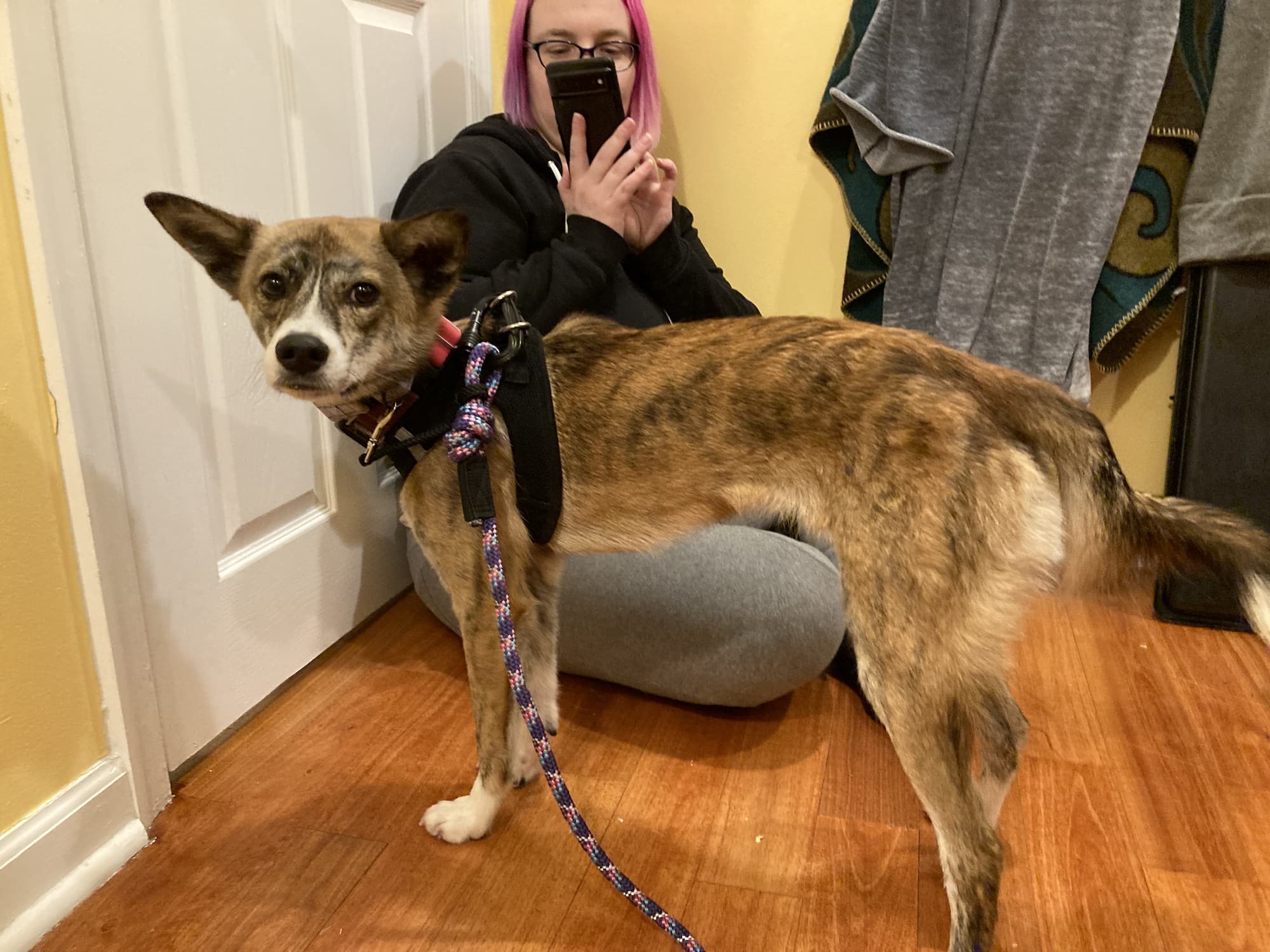
The most exciting thing that happened in 2022: we adopted a new dog! Meet Noodle:
He’s a ~1 year old jindo mix from Korean K9 Rescue and he has been an amazing addition to our family. He’s curious, playful, and gets along with everyone. He’s also been a good influence on our other dog, Lemon, and is helping her come out of her shell a little bit more.
Also in life changes this past year, I finally got an (adult) diagnosis for ADHD, something I was diagnosed with as a kid and never treated for because I could, quote, make eye contact? And didn’t need it? Despite almost failing out of middle school? After 34 goddamn years on this Earth I am finally taking some meds for it, and I’ve noticed an improvement in my overall focus, concentration, and ability to actually start tasks. It’s not drastic by any means, but I’ll take what I can get. Looking forward to seeing how that evolves over the next year and trying not to mourn what could have been.
Hobbies
I’ve been doing some drawing and writing this past year, but mostly I’ve focused on improving my music skills. In addition to my regular music lessons, I participate in a weekly challenges on a music theory discord I’m in, which has been great for keeping me practicing.
Here’s some originals from the past year:
And some rearrangements/remixes:
I’ve also played an ungodly amount of Horizon: Forbidden West. Will that change in 2023? Probably not. (Though I have started playing The Last of Us, thanks to the new show!)
I had the privilege of designing this year’s WordPress default theme, Twenty Twenty-One, which was released yesterday alongside WordPress 5.6. I started working on the initial concepts for the theme back in July, so seeing it finally launched is fantastic.
Thanks to my amazing team of co-contributors: my co-lead Carolina Nymark, who spearheaded development of the theme, our theme wrangler Jessica Lyschik, and our supporting team including Beth Soderberg, Ellen Bauer, and Jonathan Desrosiers (go Sox!). Special thanks to Ari Stathopoulos, Kjell Reigstad, Allan Cole, Jeff Ong, Justin Ahinon, Rolf Siebers, Simon Resok, Guido Offermans, Kishan Jasani, Kelly Choyce-Dwan, and dozens of others for their numerous contributions to the theme, to Sarah Ricker and Enrique Sanchez for their guidance and help in making this theme WCAG 2.1 AAA-compatible, and to Josepha Haden and Chloé Bringmann, who always rallied up support when we needed it.
Keep an eye on this space for a full breakdown of the design process sometime soon.
I’m working on a demo site for a post I’m writing, using the new Twenty Twenty theme for WordPress. I wanted to try doing a riff on the typical three-column-callout pattern. I liked the options I came up with, and wanted to share them.
You can add these to your WordPress site by downloading the .json files and uploading them into your Reusable Blocks page in your site admin, located at /wp-admin/edit.php?post_type=wp_block. Then, you can find them in your block library under the “Reusable” category. When you add them to your content, you can make them single-use by clicking the ••• menu in your block toolbar, and selecting “Convert to Regular Block.”
Note: To match the designs you see below, you’ll need to be running WordPress 5.3 or later, the Twenty Twenty theme, and ideally, the CoBlocks plugin.
Option 1
Pretty straightforward — 2/3rds primary CTA, 1/3rd secondary CTAs stacked, wide-width. I’ve used an icon here from CoBlocks to add some emphasis to the primary CTA, but you could forego if you have a lot of text, or even use an image. A circular image like a headshot would work well here.
Similar to the first option, but left-aligned instead of centered, shorter, and full-width. The secondary CTAs are further de-emphasized by using links instead of buttons.
This layout plays with having an offset right column, which I’ve accomplished with a spacer block. You might need to tweak the height of the space to get it to work on your site. The left column is effective because the image is transparent, so it blends in well without edges. Any transparent image, or image where the background matches the background you choose, would work here. This could also easily be a square image, middle column, and the only one row in the right column. The layout is wide-width but could easily be full-width if you wanted, depending on your site’s background color.
Another full-width layout, this one black. Like the above layout, it’s effective because the image’s background is also black, so it blends in. Instead of multiple text columns, this uses a large row and two smaller columns in the row beneath.
I received over 20 replies, many of which listed the same few factors. Here they are, ranked by mentions:
Recent updates: 11
Active installs: 7
Documentation: 7
Ratings: 6
Reviews: 6
Support forum response: 6
Read code: 5
Description: 5
Recommendations (word of mouth, twitter, facebook, meetup): 5
Developer name recognition: 4
Test the plugin: 3
Google: 2
Screenshots: 2
No upsells: 1
Check for security vulnerabilities: 1
Available on WordPress.org: 1
Unbranded: 1
Reviews outside of WordPress.org: 1
Simplicity: 1
The top 8 are all featured either in the plugin cards, or detail pages. So I wondered: what’s missing? What information would people like to see in order to better evaluate the plugins they’re installing?
List of hosting providers where the plugin was tested
Link to external (direct) support
Link to external documentation
Link to external quick-start guide
Link to issue tracker
Related plugins
Plugins users have also installed
All WordPress versions on which the plugin is active
Ability to test the plugin without downloading it
“GitHub link” was mentioned several times:
I often like to take a look at the code/activity/issues. It’s usually somewhere, but just not in a consistent place. I may be an outlier on that though.
Yeah – would be helpful to see who the developers, what the open issues are, and how active development is. Those are all things I usually look for when finding plugins.
Surfacing developer reputation was a big suggestion:
Some ideas: – # of releases or patches they’ve contributed to WordPress core, or that they are a component maintainer (very high signal of quality) – Above average activity in the support forums outside their plugin – IRL: meetup host, WordCamp organizer/speaker/attendee
I was thinking about WordPress themes this morning, and how hard it is to find a good theme. There are tons of themes that look great, but once I install them, I either have no idea how to set up the theme to look like the demo, or I’m presented with so many customization options that I say “whelp, nevermind!” and go try to find another one.
In theory, ratings are supposed to help you find better themes, but they’re so open to interpretation that you really only end up getting unfocused opinions. I like this, therefore, five stars. I hate Gutenberg, therefore, zero stars. It’s not really helpful.
What if theme ratings were more granular? For example:
Aesthetics ☆☆☆☆☆
Setup ☆☆☆☆☆ ◻️ Someone set it up for me
Works as intended ☆☆☆☆☆ Did you encounter any bugs?:
Has the features I need ☆☆☆☆☆ Elaborate:
Helpful support ☆☆☆☆☆ ◻️ I haven’t contact support
Optional Comments:
Every person using a theme is, of course, biased — so in some ways the ratings would still be arbitrary — but by providing some semblance of categorization, we might at least help people think about the theme experience.
You might be saying (because I am also thinking) — “oh, but Mel, it’s already hard to get people to fill out ratings. By adding more questions, wouldn’t it make it even harder?”
Partially, yes. Someone’s gonna look at that form and be like “nah, pass.” But for some, the additional structure might make them more likely to review. I hate being presented with a single star rating field and a comment field because it feels so unstructured, I never know what to say. Since my name is always included, I feel like I need to have a smart response or else someone’s going to come along and be like, “wow, Mel’s an idiot.” Having a guided form like the above helps me at least rationalize how I feel about something, and by breaking it down into specifics, I feel like I can provide a more accurate rating.
Anyway, just random a Sunday morning afternoon thought.
One of the goals for Gutenberg Phase 2 is a new navigation menu block. There’s already been a lot of thought and discussion on this, which I wanted to gather into one location so it’s easier to review and compare all the options.
Early concepts
There are a number of early explorations on the GitHub thread:
WordCamp US contributor day
At the WordCamp US contributor day, a group got together and started thinking through a navigation block:
Make it easier for organizers to add WordCamp-specific content to their sites.
Review how the community uses the existing shortcodes. For examples, are there any settings we can deprecate or combine with other settings? Is anything missing? Has anyone put together their own “hacks” to make the shortcodes accomplish something they weren’t designed for?
For the sake of scope, I limited the first round to the Organizers, Schedule, Sessions, Speakers, and Sponsors shortcodes.
Process
I started the project with some lo-fi research. I reached out to WordCamp organizers via the Make/Community p2 and asked a small series of questions about their experiences with the shortcode. I was aiming for just enough research to get myself started.
I was happy to receive a great deal of helpful feedback from organizers. There were several comments that led to illuminating conversations about how people customize and curate their WordCamp websites that are very different from how my organizing team sets up our website. I went in with a bunch of assumptions, and while some of them were validated, some of my assumptions were, naturally, not in line with other organizers. This is why having these basic research conversations is so important — even if I didn’t have the time or a longer research process, chatting with other organizers via p2 provided a wonderful array of thoughts and opinions that gave me a better sense of the project.
After I gathered feedback, I started outlining the settings for each existing shortcode in an InVision Freehand. I then started consolidating, removing, and adding any necessary settings. The Freehand was nice because I could throw in a bunch of text along with some super basic sketches. This allowed me to better communicate what I was thinking, and get early feedback from both WordCamp organizers and the developers planning on building the blocks.
After establishing what I thought was a good initial scope, I started mocking up one of the more complicated blocks: Speakers. I decided to go straight into higher-fidelity visual work because the majority of patterns already existed within a Sketch library, which meant putting together a block was quick and easy.
Gutenberg Block Guidelines
Gutenberg blocks have a couple key design principles:
Let’s apply these principles to the Speakers block.
I started with this scope:
The block is dynamic — it draws content from the Speakers custom post type (CPT) and displays that content on the page.
While I’d like content to be directly editable via the block, instead of solely through the CPT, that will take a great more effort and is better off being explored in a future version of the block. So, none of the actual content inside the block will be directly editable — just the display of existing content.
You should be able to select either the entire Speaker list, or individual Speakers.
Speakers are often announced in posts ahead of time; it would make it easier for organizers to craft these posts if they’re able to select a few speakers to dynamically display via block.
You need to be able to control the following settings:
Show or hide avatar, and corresponding size and alignment;
Show or hide session details;
Show or hide biography;
Where their name links to;
How they’re sorted.
Personally, I felt that speakers should be able to be arranged in a list, or in a grid. It’s a common design pattern for conferences.
What belongs in the block?
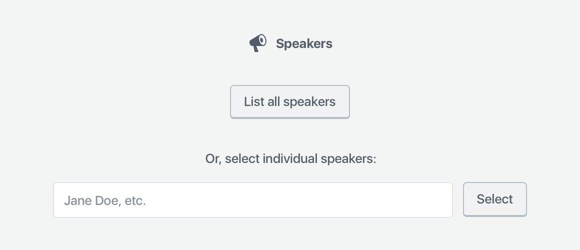
Because the block pulls in dynamic content, the only setup it requires is whether or not it should display all speakers, or individual speakers. This information is necessary to show the block, so it needs to be gathered via a placeholder when you add the block to your page or post.
If you can provide good default content, and that default content is easy to customize, you don’t need to use a placeholder. However, if there isn’t a clear default state that would work for most people, it might make sense to use a placeholder to gather that information.
In the case of Speakers, the smart default could be “List all speakers” — but that block will already be pre-generated on the Speakers page. Thus, the majority of use-cases will probably be on custom pages or posts. It makes sense, in this case, to expose all of the selection options in the placeholder.
The Speakers block placeholder
That’s all this placeholder needs. Once you select the list of all speakers or an individual speaker, there are no other primary settings required for the block to be correctly configured — it just works.
What belongs in the block toolbar?
Any secondary settings get shown within the block toolbar, with one caveat:
One notable constraint with the block toolbar is that it is icon-based UI, so any controls that live in the block toolbar need to be ones that can effectively be communicated via an icon or icon group.
Within the above scope, the only setting which seems important and can easily be represented is the layout — so, whether Speakers are shown in a list, or in a grid.
The Speakers block toolbar
Note: the live version will also show the block icon in the leftmost position in the toolbar.
What belongs in the sidebar?
What I’ve designed thus far for the Speakers block is totally usable. You could plop this down into a page or post, publish, and call it a day — no customization required.
However, we have a diverse community with a wide variety of design needs. They might want to customize the block to suit their particular speakers and their WordCamp site design.
That where the sidebar comes in — it houses all of the optional block settings. Because people can close the sidebar, and might never see these settings, they have to be optional.
Think of the sidebar as something that only power users may discover.
These guidelines helped me decide that these settings should be optional:
Show or hide avatar, and corresponding size and alignment;
Show or hide session details;
Show or hide biography;
Where their name links to;
How they’re sorted.
I decided to organize them into three panels: photo settings (all the avatar settings), content settings (biography, speaker information, and speaker link), and Sorting and Filtering (sorting like alphabetical, date, etc., along with the number of columns if you’re displaying speakers in a grid).
I also took the liberty of rewriting and regrouping some of the settings to make (what I thought was) more sense. I didn’t just want to copy the shortcode into a block — I wanted to improve on the experience for WordCamp organizers. These particular groupings and names went through lots of iteration.
Iteration
Nothing is perfect on the first try. When I had a block design that felt presentable, I used InVision to turn it into a simple static prototype and presented it to the community. The feedback I received from organizers was vital. How could I succeed without input from the people who are going to use the block?
A bunch of micro-discussions resulted — some focused more broadly on the block, others narrowed on specific features. I did some quick back-and-forth iterations with organizers, posting small mockups to help us communicate. Some of these conversations branched across the various block discussions, so before I published the final mockups, I did a round of consistency updates to make sure the patterns matched on each block.
Result
Adding all speakersAdding individual speakersAdding groups of speakers
Once the feedback trickled down and I revised the blocks, I published them all in a post. I’m hoping that once the blocks get built, we’ll be able to get some more feedback from upcoming camps and fine-tune any weird or unexpected behavior.
This project was really fun. It’s been a while since I’ve had time to work on WordPress community projects — I’ve been so focused on the core software lately. And honestly, shortcodes are a terrible experience. I need to constantly try to memorize, or look up (and figure out how to understand!) the various parameters a shortcode takes. Blocks provide a really exciting opportunity to make it way easier to add all kinds of content. I’m already starting to see a ton of cool blocks enter the ecosystem. Maybe I’ll have a chance to write about that next. 😁
For many people, myself included, 2017 has been an exhausting year.
I started off the year in a haze of anxiety and fear over the US election — a haze that only really stopped when I very intentionally stepped back from social media for a little while and tried to give myself some space. I donated when I could, and voted in my local elections, but otherwise feel like I didn't give enough or do enough to counteract all of the awfulness going on in my country. I've felt powerless and paralyzed. In 2018, I want to find sustainable ways to empower myself and my communities.
Improving my mental health was a focus of 2017. I was, quite honestly, a disaster in the beginning of the year. I experienced multiple panic attacks. After a significant amount of time and effort, I was finally able to see a psychiatrist. (Seriously y'all, why is it so hard?) For most of my life I've been opposed to medication (for myself, not others), but my anxiety meds have made a world of difference for me. My stress and anxiety are manageable, and actually reflective of reality, rather than high-key all the time for no reason. I feel like going out and being social again. I haven't had any more panic attacks. It took a lot of work, but getting the mental health support I needed was worth it.
My family went through a lot of pain and strife this year, which took up a great amount of mental and financial resources. I think — hope? — it brought us closer together, and we made it through the year intact. I'm considering that a success. I hope next year brings some much deserved peace and prosperity to my family.
Work was pretty intense this year. I took on a lot more responsibility than I thought myself capable of handling. In a lot of ways, I was right — I made a lot of mistakes this year. I got mired in details that didn't matter as much as the bigger picture. I learned and grew quite a bit. I led a WordPress release and it actually went pretty well. I learned a lot about my work habits (and my brain) that I'll be able to put to good use next year. I'm starting out 2018 with a professional coach, to help keep myself on track and focused, and to learn even more about how I can make the best use of my skills. Better late than never, eh?
A lot of people supported me this year:
My partner Kelly, who was with me every step of the way. Thanks for always supporting me, cheering me on, and being patient with me despite many of this year's hurdles. Thanks for listening to me rant, and helping me deal with the enormous work and family stress I was under this year. I hope I can always be as good a partner for you as you've been for me.
My older brother Chris, who saw our family through some incredibly tough times this year. Thanks for your composure, your leadership, and for making sure our family got through the year with a roof over everyone's heads. This year would have been a whole lot harder without you.
My coworker and friend Tammie, who was my cheerleader the whole year. Thanks for the check-ins, the support and confidence, and for checking my work to make sure I was showing my best.
My team lead Josepha, who helped me through many difficult situations and worked hard to find the best way to support me. Thanks for listening, and for keeping me on-track.
My WordPress release buddies Weston and Jeff. I couldn't have made it through the year without either of you. We did it together.
All my wonderful internet friends. I love you all ❤️
My therapist. Paying someone for professional emotional labor is the shit, y'all. A++ would recommend.
2017 was hard. Damn hard. I hope that it's made me stronger, more resilient, and a better friend, coworker, and partner.
Two years, I was sitting around a table of WordPress core and community leaders, swearing that I'd never lead a WordPress release. Yesterday, along with my Co-Lead Weston Ruter and Deputy Lead Jeff Paul, I released WordPress 4.9.
It feels a little like we've been working on this release forever. We kicked off the process in June, and since then we've been designing and building features to improve site customization. Launching last night felt shocking, and a relief. I've had many large projects launch in my career, but nothing as potentially impactful as this. I am still in awe of it all.
This was the first WordPress release where we've really embraced the co-leadership of design and development, and I think it was successful. Weston's organization and attention to detail really kept us on track. I am kind of a passionate individual (my friends are probably laughing now), and having such a solid co-lead to temper me really helped balance out this release. There's no way I would have been able to do this without him.
Weston wasn't the only organized one this release — without Jeff Paul, we would have been mired in the day-to-day planning. Having Jeff to keep track of meetings, check in with us, and review each stage of the release allowed us the freedom to focus on product decisions. His contributions have been immeasurable.
I am also thankful to 443 contributors who made this release possible. Over four hundred people! That's amazing. Among them are some fantastic developers I collaborated with almost constantly throughout the release: Konstantin Obenland, Sayed Taqui, and Brandon Payton. Michelle Weber and Krista Stevens provided much-needed copywriting help. Kathryn Presner's tremendous expertise in customer support and success helped make sure we were solving the right problems.
Lastly, there's no way I would have made it through this process without the emotional support of my friends and teammates at Automattic. My team lead Josepha Chomphosy listened to my every wish, complaint, and worry; both her advice and leadership helped me solve many issues throughout the release. Tammie Lister was my constant cheerleader and was gracious enough to review all of my design work, and provided me with crucial puppy videos during the final hours. Gary Pendergast was always there to remind me to have some fun and reassure me when I was worried I would fail. And how could I leave out my partner Kelly Dwan, who suffered through chaos, long nights, and probably too much delivery food over the past couple months with nothing but love and support?
WordPress is a group endeavour, and I am so honored to work with all of you.


![A screenshot of the Classic editor in WordPress, featuring a speaker shortcode. The shortcode reads: [speakers show_avatars="true" speaker_link="permalink" avatar_size="300"].](https://i0.wp.com/melchoyce.design/wp-content/uploads/2018/11/shortcodes.png?resize=1024%2C421&ssl=1)