I received over 20 replies, many of which listed the same few factors. Here they are, ranked by mentions:
Recent updates: 11
Active installs: 7
Documentation: 7
Ratings: 6
Reviews: 6
Support forum response: 6
Read code: 5
Description: 5
Recommendations (word of mouth, twitter, facebook, meetup): 5
Developer name recognition: 4
Test the plugin: 3
Google: 2
Screenshots: 2
No upsells: 1
Check for security vulnerabilities: 1
Available on WordPress.org: 1
Unbranded: 1
Reviews outside of WordPress.org: 1
Simplicity: 1
The top 8 are all featured either in the plugin cards, or detail pages. So I wondered: what’s missing? What information would people like to see in order to better evaluate the plugins they’re installing?
List of hosting providers where the plugin was tested
Link to external (direct) support
Link to external documentation
Link to external quick-start guide
Link to issue tracker
Related plugins
Plugins users have also installed
All WordPress versions on which the plugin is active
Ability to test the plugin without downloading it
“GitHub link” was mentioned several times:
I often like to take a look at the code/activity/issues. It’s usually somewhere, but just not in a consistent place. I may be an outlier on that though.
Yeah – would be helpful to see who the developers, what the open issues are, and how active development is. Those are all things I usually look for when finding plugins.
Surfacing developer reputation was a big suggestion:
Some ideas: – # of releases or patches they’ve contributed to WordPress core, or that they are a component maintainer (very high signal of quality) – Above average activity in the support forums outside their plugin – IRL: meetup host, WordCamp organizer/speaker/attendee
Reading through a large backlog of articles I’ve had open. Here are some notes and observations, mostly for my own benefit.
The history of web design can be seen as a set of tensions between designers wanting things to be positioned with utmost precision, and the web pushing back on some of that control.
Fascinating look into the history of type, leading up to problems surrounding line-height on the modern web.
it’s too easy to conflate the h4 style—intended to be shorthand for “the fourth largest heading style”—into actually meaning “use an <h4> element.” After all, <h2 class="h4">is a bit of a mindbender and seems wrong at first glance. I’ve seen those who don’t understand the power of HTML and CSS—whether that’s designers that aren’t very familiar with front-end code or full-stack developers who focus more or back-end or DevOps than front-end—feel forced to choose between appropriate styling and semantic code. They’ll pick an inappropriate element because it looks visually looks right or pick what visually looks right at the expense of semantics and accessibility, defeating the inherent advantages that HTML and CSS have out-of-the-box.
A breakdown of a couple different methods for creating type systems, and their various pitfalls. Mall comes up with a couple different fun ideas based on guessability, then demonstrates they are all insufficient, before going into what he things the most flexible system could be.
For those who think it trivializes our political process to judge candidates by their typography—what would you prefer we scrutinize? Qualifications? Ground into dust during the last election. Issues? Be my guest. Whether a candidate will ever fulfill a certain campaign promise about a certain issue is conjectural.
But typography—that’s a real decision candidates have to make today, with real money and real consequences. And if I can’t trust you to pick some reasonable fonts and colors, then why should I trust you with the nuclear codes?
Intersection of politics + type = this post is my jam. Butterick’s sharp and witty take on campaign design has breathed new life into my sad, tired bones. I felt my skin clear as I laughed my way through each campaign website. 10/10 would read again.
Relevant, given my work on campaign assets. A lot of his advice and takeaways I’ve experienced on a much smaller scale.
Aside: wouldn’t it be cool if I wrote a book interviewing people who worked on presidential or high-profile legislative campaigns? I think it’d be cool.
Today, we may think we own things because we paid for them and brought them home, but as long as they run software or have digital connectivity, the sellers continue to have control over the product. We are renters of our own objects, there by the grace of the true owner.
I’ve been feelin’ this lately, especially with my video game collection. For the past couple years I’ve all about digital downloads — they save physical space, can load faster, are easier to acquire, etc. However, if something catastrophic were to happen to my account, that’s… hundreds of dollars and years of games, gone.
I’m a voracious Kindle reader, but I’m also afraid to get rid of books I own digital copies of, in case my Kindle account is ever locked. Owning physical books feels like a luxury I don’t have the privilege for anymore, but I’m keenly aware that each new Kindle purchase is just renting.
I need to get more serious about indie tech.
…in the tech industry, with our motto of “strong opinions, loosely held”, we’ve glorified overconfidence.
I disagree a little with the author’s premise — I don’t think “strong opinions, loosely held” has to mean belligerent overconfidence — but the advice around adding a degree of uncertainty to your statements feels sound.
It’s okay to love a hobby the same way you’d love a pet; for its ability to enrich your life without any expectation that it will help you pay the rent. What would it look like if monetizing a hobby was downgraded from the ultimate path to one path? What if we allowed ourselves to devote our time and attention to something just because it makes us happy? Or, better yet, because it enables us to truly recharge instead of carving our time into smaller and smaller pieces for someone else’s benefit?
As a “creative,” this whole article resonates with me. Now that I’m in my 30s, I’ve started allowing myself to embrace creative hobbies for the hell of it, though I still struggle with the tension of “I’m spending all this money on my hobbies, so surely I need to, well… get some of that money back?” But what’s the use of having a job that fulfills more than my basic needs if I can’t spend that money on enriching my life through music and art?
Because the problems at hand are complex systems problems – where the root causes are not the actors themselves, but the ill-designed structures and incentives that dictate their actions – we should think about redesigning the rules and incentives of social, political, and economic systems as the path forward.
This article spoke to the political theory fan in me (it was my college major, after all) and while I didn’t completely understand everything, I was able to follow the general themes and found myself nodding along with the author’s proposed solutions. It’s a good exercise in potential solutions for our fucked up mess of a country, but I wonder how we’d go about actually implementing said solutions. It feels like in order to implement the solutions, we’d need… to have already implemented some of the solutions. Or at the very least, someone needs to unseat Mitch.
Ideas ride us into battle like warhorses. We can witness, participate in, and even lead these battles, but their true meaning eludes us. We don’t really know where ideas come from, nor how to control them.
Somehow or another I subscribed to Nadia Eghbal’s newsletter, The Internet is a City. This post she mentioned writing in her latest email caught my eye: “I wrote about how the world is run by ideas, not people, and how reputation can become a blessing and a curse for creators.” This is a good one sentence summary of the post, and I’m not sure what else to mention, other than I enjoyed her philosophizing on the topic.
I have come to regard [subtlety] as something of a dark art, a force of nature that can be summoned but never fully harnessed, and can backfire at the slightest misstep. Anyone can pick up a bullhorn and make her intent clear to all, but to attempt something subtle is to step blindfolded into the unknown. You are always teetering on the brink of insanity. You are always walking on a wire strung across an abyss, hoping to make it from one end to the other without losing your balance, or your mind.
It took me a couple months, but I’ve started seeing my coach again this year. One of her first assignments for me is to think about the advice I’d give myself for the rest of this year. I’ve come up with a couple ideas — some of which are perennial problems, while some are problems I’ve only recently started thinking about thanks to therapy and coaching.
Focus
Ah yes, focus, my mortal enemy. So illusive and mercurial. What does focus even mean for me? Well, I should definitely allow myself more heads-down design time. Close Slack. Close p2s. Close email. Put “do not disturb” on. I struggle with focus, so giving myself more space to focus by turning off distractions can help.
And if that doesn’t work? Allow myself to do some passive distractions, like washing dishes or some watercolor painting. I often make breakthroughs on a problem while doing something else with my hands.
Lean Out
I have too many commitments. I need to scale back on some of them, especially projects that aren’t directly contributing to my growth. This means leaning out instead of jumping forward at new opportunities. After all, the more I’m doing, the less focus I have for the most important tasks. This is super hard for me! The key to this might be external accountability… or signing out of some volunteer Slack groups when some projects wrap up.
Be Vulnerable
Like most humans, I suck at vulnerability. My coach had me read Brené Brown’s Daring Greatly, and I need to continuously take her advice to heart.
This means…
Don’t be afraid to look stupid
Ask more questions
Allow myself to talk out problems with other people
Ask for, and accept, help
Allow myself to take breaks and time off when I feel like I need it
Grow Without Shame
Related to being vulnerable, I should allow myself to be in a constant state of growth. I need to give myself permission to stop comparing myself to other people, and instead, look to them as inspiration — how can I reach that level of skill? I need to embrace a beginner mindset, and get rid of “I should already know this” from my vocabulary.
It’s okay to not know things! I should be aware of what I don’t know, and then let curiosity drive me. I can choose what I want to learn more about. I can on the things I WANT to know more about and improve them with intent. Rather than striving for perfection — which is an impossible task — I should be striving for excellence.
Recognize my Experience
Not only should I not be ashamed to learn and grow new things, but I also shouldn’t be afraid of speaking up and asserting myself when I’m an expert. I’ve gotten way better at this in the last couple years (leading a WordPress release actually helped) but I still have a long way to go. As we’d say at GRCB, I rock! 🤘
I was thinking about WordPress themes this morning, and how hard it is to find a good theme. There are tons of themes that look great, but once I install them, I either have no idea how to set up the theme to look like the demo, or I’m presented with so many customization options that I say “whelp, nevermind!” and go try to find another one.
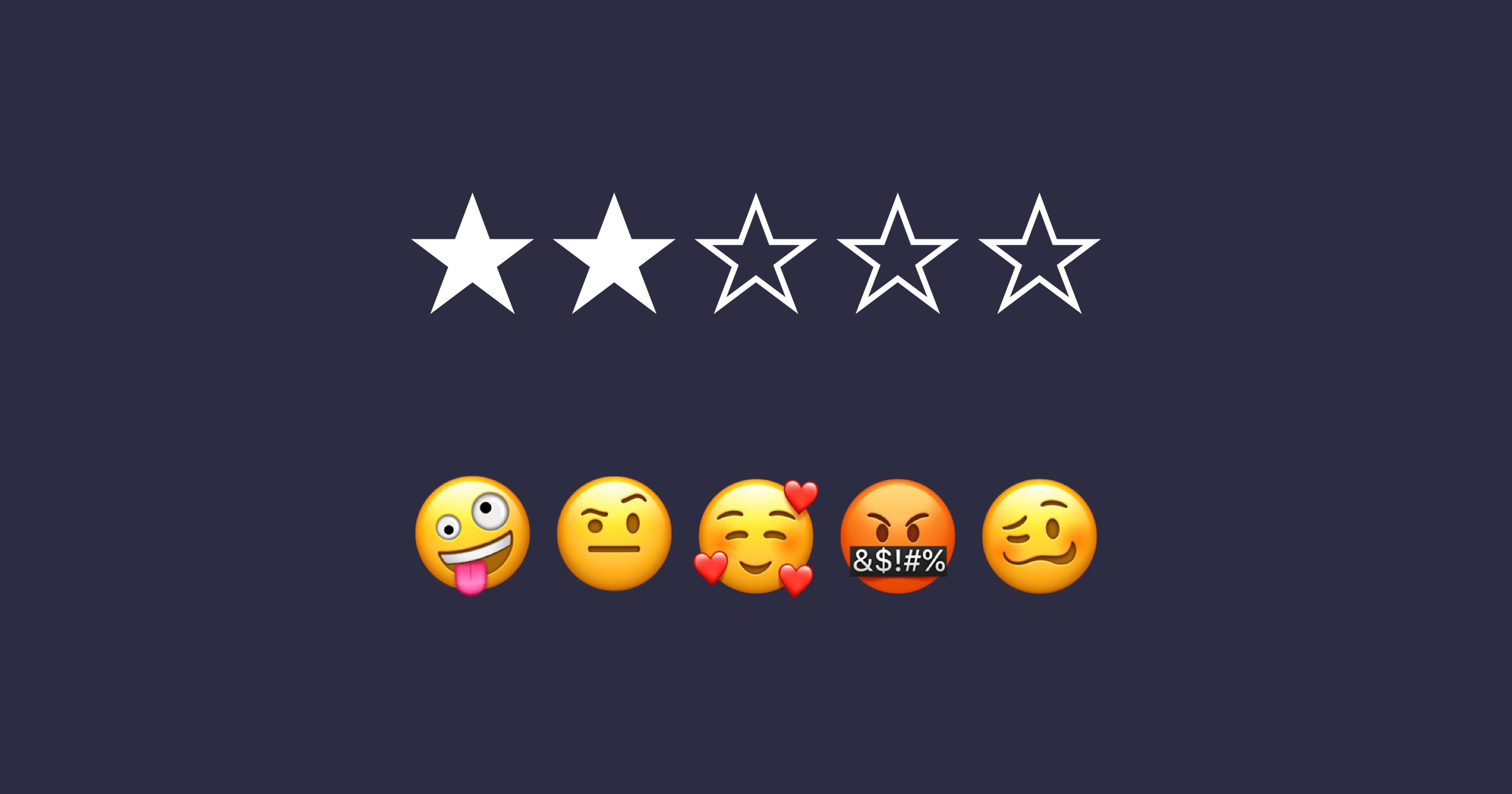
In theory, ratings are supposed to help you find better themes, but they’re so open to interpretation that you really only end up getting unfocused opinions. I like this, therefore, five stars. I hate Gutenberg, therefore, zero stars. It’s not really helpful.
What if theme ratings were more granular? For example:
Aesthetics ☆☆☆☆☆
Setup ☆☆☆☆☆ ◻️ Someone set it up for me
Works as intended ☆☆☆☆☆ Did you encounter any bugs?:
Has the features I need ☆☆☆☆☆ Elaborate:
Helpful support ☆☆☆☆☆ ◻️ I haven’t contact support
Optional Comments:
Every person using a theme is, of course, biased — so in some ways the ratings would still be arbitrary — but by providing some semblance of categorization, we might at least help people think about the theme experience.
You might be saying (because I am also thinking) — “oh, but Mel, it’s already hard to get people to fill out ratings. By adding more questions, wouldn’t it make it even harder?”
Partially, yes. Someone’s gonna look at that form and be like “nah, pass.” But for some, the additional structure might make them more likely to review. I hate being presented with a single star rating field and a comment field because it feels so unstructured, I never know what to say. Since my name is always included, I feel like I need to have a smart response or else someone’s going to come along and be like, “wow, Mel’s an idiot.” Having a guided form like the above helps me at least rationalize how I feel about something, and by breaking it down into specifics, I feel like I can provide a more accurate rating.
Anyway, just random a Sunday morning afternoon thought.
One of the goals for Gutenberg Phase 2 is a new navigation menu block. There’s already been a lot of thought and discussion on this, which I wanted to gather into one location so it’s easier to review and compare all the options.
Early concepts
There are a number of early explorations on the GitHub thread:
WordCamp US contributor day
At the WordCamp US contributor day, a group got together and started thinking through a navigation block:
Year’s end is neither an end nor a beginning but a going on, with all the wisdom that experience can instill in us.
Hal Borland
I’m not super into New Year’s resolutions. They take a lot of habit-building work, and just tend to leave me disappointed with myself. This year I’m focusing on maintaining and growing habits I built in 2018.
Health
I found a personal trainer last year, and went to the gym nearly every dang week. The only times I didn’t make my appointment were due to travel, and then, I almost always doubled up the week before or after to make up for it. Swarm tells me I checked in to my gym 64 times. I’ve become stronger, and have more endurance. My back hurts less. I’ve discovered I love lifting weights. It’s expensive as hell, but it’s been so worth it.
In 2019, I want to continue seeing my trainer weekly. If I can make it one more day a week, whether for a class or a workout on my own, I’ll consider that a success. I think scheduling it into my calendar will help.
Balance
Learning how to say no has been a longterm goal of mine. I’m a people pleaser — I like helping, and don’t like disappointing folks. However, there’s only so many things you can say yes to. I did pretty well at limiting what I said yes to last year, and I’d like to keep it up.
Over my sabbatical, I learned the important of taking space away from work. I need to be intentional about creating this time for myself in the future. In order to achieve balance, I need time for rest, reflection, and personal creativity.
Professional Growth
I took a break from speaking last year — I gave just one talk the entire year. I needed to take this kind of break to regain some energy and equilibrium, but this year I’m ready to bounce back. I’d like to give 4–5 talks throughout the year. I’ve already put in my first speaker applications, for Lesbians Who Tech in February and WordCamp Europe this summer in Berlin!
I did a good job of blogging last year. This year, I’d like to do a great job. I have a tentative goal set for myself of “write something every other week,” but we’ll see whether or not I stick to that. I definitely want to write at least one post per month, at the bare minimum. If I can write more this year than I did last year, that’ll be a win.
Personal Growth
I’ve been learning how to drum for a little over two years now. Last April, I attended Ladies Rock Camp Boston, where I joined a band, we wrote a song, and then performed it at the end of camp! My band mostly stuck together after, and we’ve been practicing together regularly since. I’d love to keep this up and finally do another performance this year, now that we have a pretty rockin’ setlist. Already looking forward to my next practice tomorrow.
Lastly, I started making more art last year. I took some printmaking workshop over my sabbatical, which spawned a new habit of watercolor painting. I’d like to continue painting this year and improving my watercolor skills. You can see what I’m working on in my Instagram stories!
I read a lot of really good fiction this year, mostly sci-fi, speculative fiction, and fantasy (which is not unusual for me). I finally got to read a couple classics I’ve been meaning to dig into for a while, such as The Left Hand of Darkness and Earthseed, and my sabbatical provided a good opportunity to re-read the entire Harry Potter series from start to finish, which I like to do every two or three years.
Here’s my list, in vague chronological order of read (though I’m sure I’m missing one or two):
Taming Your Gremlin by Rick Carson
Daring Greatly by Brené Brown
And I Darken series (And I Darken, Now I Rise) by Kiersten White
Tempests and Slaughter by Tamora Pierce
An Ember in the Ashes series (An Ember in the Ashes and A Torch Against the Night (re-read), A Reaper at the Gates) by Sabaa Tahir
The Weaver by Emmi Itäranta
An Unkindness of Ghosts by Rivers Soloman
Sky in the Deep by Adrienne Young
The Left Hand of Darkness by Ursula K. Le Guin
Earthseed series (Parable of the Sower, Parable of the Talents) by Octavia Butler
The Harry Potter series (all of ’em) by JK Rowling (re-read)
The Harper Hall series(Dragonsong, Dragonsinger, Dragondrums) by Anne McCaffrey (re-read)
Hullmetal Girls by Emily Skrutskie
The Tensorate series (The Black Tides of Heaven, The Red Threads of Fortune, The Descent of Monsters) by JY Yang
Mask of Shadows series (Shadow of the Mask (re-read), Ruin of Stars) by Lindsey Miller
The Brilliant Death by Amy Rose Capetta
Children of Blood and Bone by Tomi Adeyemi
Rebel Seoul by Axie Oh
The Poppy War by R. F. Kuang
Survival Instincts by May Dawney
The Traitor Baru Cormorant by Seth Dickinson (in progress)
I already have a bunch of books queued up for 2019 that I didn’t get to this year — especially some non-fiction books I’ve been meaning to get around to. Here’s to hoping I can make a good dent in my Kindle backlog!
Earlier this month, I had the pleasure of writing an article for 24ways.org, “the advent calendar for web geeks.” I wrote on a topic I know well — working remotely. If you’re a remote worker, or thinking about pursuing a remote role, give it a read:
I’ve wanted a better way of making restaurant menus since first working on WordPress.com’s restaurant menu custom post type a couple years ago. The process felt so slow, clunky, and divorced from the final product. CPTs never felt like the right method for providing this kind of content. Blocks provide a perfect opportunity to redesign how we add restaurant menus to our a site — they’re UI-first, and both edited and previewed in-context.
What the best way to approach this kind of block? If I were to convert the WordPress.com restaurant CPT 1:1, it would look like:
A parent block to act as a container.
Child blocks for menu sections, featuring names and descriptions.
Child blocks within menu sections for menu items, featuring a placeholder for featured image, name, price, and description.
Custom taxonomies (“menu labels”) for menu items.
That seems like a whole lot of overhead for some content that, let’s be honest, doesn’t change very often. In many cases, the most a menu is changed is seasonally. I think we can ease the setup and maintenance of the block quite a bit.
Zooming In
Let’s look at simplifying restaurant menus down to their basic element: menu items. What if the only restaurant block that exists was a menu item?
Menu item on the top left, price on the top right, and description below were the most common pattern I found when reviewing restaurant menus.
Pros
Super simple — only need to enter three lines of text.
Minimal settings. Bold and italic options for some minimal text formatting control, but otherwise, no sidebar options.
Cons
You have to add a new block for every menu item, which will get tedious fast.
Because menu items aren’t grouped into a shared container, styling options for your menu are limited.
Doesn’t make sense to be able to add menu items everywhere.
These cons seem pretty big; let’s widen the scope.
Zooming Out
The next level above a menu item is a menu section. This is a parent container that features a section title, and individual menu items as children.
Heading and Menu Item contained within the same container block.
Pros
A wrapper means the entire section can be targeted with custom CSS, or support layout options.
The block could default to adding a new menu item next, so all you need to do to get another item is press “enter” at the end of the description field.
The block is still relatively simple, compared to the original.
Cons
Doesn’t support the complex scenarios that the original CPT supports, including taxonomies and featured images.
This feels like a happy middle-ground between the existing CPT, and a completely zoomed-in version of the block. The restaurant menu block acts as a wrapper with minimal default settings (columns, background color, text color) that could be extended to include fancy borders, background images, or other decorative elements. These could alternately be block styles.
Additionally, the block could register some core blocks like additional headings, paragraphs, and images as child blocks:
This negates the need for featured images, because you can insert images inline. And, most menus I’ve seen don’t show a thumbnail for every item on their menu — they mostly scatter highlights throughout the menu. This system supports that better, allowing for more flexible layout and display of menu items.
Block settings
Speaking of layout, this block could easily support some columns:
Two column menu layout.
I also included a toggle on the menu item itself for allergens. I don’t think this is necessarily the best label, but I couldn’t think of a better word. Toggling “allergens” on adds a new field underneath the item description, so you can add some extra details like “gluten-free” or “vegan.”
Allergen setting activated in the block
Allergen setting in the sidebar
The supported core blocks (heading, paragraph, image, and gallery) would keep their default settings.
Prototyping
After mocking up most of the block states, I linked them together in Sketch with the InVision Craft plugin:
I do this because I find actually clicking through the various block states is the best way to wrap my head around how the block actually works, and easily allows me to catch any errors I made while mocking up the block. In this case, I went through a couple rounds of minor revisions based on issues I saw in the prototype.
For example, an earlier iteration of a menu item showed the block outline around the entire block, rather than just the menu item. Most recently, I updated some of the toolbars to use more up-to-date Gutenberg patterns.
If you want to use this design to build your own restaurant block, that’s cool too — just credit me and link back to my site in your plugin readme.
I’d prefer if this design wasn’t used for a premium plugin, but I’m okay with you using it as a starting point — just make sure to update it and introduce new features instead of building this exact design. Honor system!
Make it easier for organizers to add WordCamp-specific content to their sites.
Review how the community uses the existing shortcodes. For examples, are there any settings we can deprecate or combine with other settings? Is anything missing? Has anyone put together their own “hacks” to make the shortcodes accomplish something they weren’t designed for?
For the sake of scope, I limited the first round to the Organizers, Schedule, Sessions, Speakers, and Sponsors shortcodes.
Process
I started the project with some lo-fi research. I reached out to WordCamp organizers via the Make/Community p2 and asked a small series of questions about their experiences with the shortcode. I was aiming for just enough research to get myself started.
I was happy to receive a great deal of helpful feedback from organizers. There were several comments that led to illuminating conversations about how people customize and curate their WordCamp websites that are very different from how my organizing team sets up our website. I went in with a bunch of assumptions, and while some of them were validated, some of my assumptions were, naturally, not in line with other organizers. This is why having these basic research conversations is so important — even if I didn’t have the time or a longer research process, chatting with other organizers via p2 provided a wonderful array of thoughts and opinions that gave me a better sense of the project.
After I gathered feedback, I started outlining the settings for each existing shortcode in an InVision Freehand. I then started consolidating, removing, and adding any necessary settings. The Freehand was nice because I could throw in a bunch of text along with some super basic sketches. This allowed me to better communicate what I was thinking, and get early feedback from both WordCamp organizers and the developers planning on building the blocks.
After establishing what I thought was a good initial scope, I started mocking up one of the more complicated blocks: Speakers. I decided to go straight into higher-fidelity visual work because the majority of patterns already existed within a Sketch library, which meant putting together a block was quick and easy.
Gutenberg Block Guidelines
Gutenberg blocks have a couple key design principles:
Let’s apply these principles to the Speakers block.
I started with this scope:
The block is dynamic — it draws content from the Speakers custom post type (CPT) and displays that content on the page.
While I’d like content to be directly editable via the block, instead of solely through the CPT, that will take a great more effort and is better off being explored in a future version of the block. So, none of the actual content inside the block will be directly editable — just the display of existing content.
You should be able to select either the entire Speaker list, or individual Speakers.
Speakers are often announced in posts ahead of time; it would make it easier for organizers to craft these posts if they’re able to select a few speakers to dynamically display via block.
You need to be able to control the following settings:
Show or hide avatar, and corresponding size and alignment;
Show or hide session details;
Show or hide biography;
Where their name links to;
How they’re sorted.
Personally, I felt that speakers should be able to be arranged in a list, or in a grid. It’s a common design pattern for conferences.
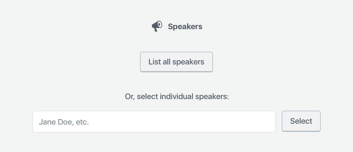
What belongs in the block?
Because the block pulls in dynamic content, the only setup it requires is whether or not it should display all speakers, or individual speakers. This information is necessary to show the block, so it needs to be gathered via a placeholder when you add the block to your page or post.
If you can provide good default content, and that default content is easy to customize, you don’t need to use a placeholder. However, if there isn’t a clear default state that would work for most people, it might make sense to use a placeholder to gather that information.
In the case of Speakers, the smart default could be “List all speakers” — but that block will already be pre-generated on the Speakers page. Thus, the majority of use-cases will probably be on custom pages or posts. It makes sense, in this case, to expose all of the selection options in the placeholder.
The Speakers block placeholder
That’s all this placeholder needs. Once you select the list of all speakers or an individual speaker, there are no other primary settings required for the block to be correctly configured — it just works.
What belongs in the block toolbar?
Any secondary settings get shown within the block toolbar, with one caveat:
One notable constraint with the block toolbar is that it is icon-based UI, so any controls that live in the block toolbar need to be ones that can effectively be communicated via an icon or icon group.
Within the above scope, the only setting which seems important and can easily be represented is the layout — so, whether Speakers are shown in a list, or in a grid.
The Speakers block toolbar
Note: the live version will also show the block icon in the leftmost position in the toolbar.
What belongs in the sidebar?
What I’ve designed thus far for the Speakers block is totally usable. You could plop this down into a page or post, publish, and call it a day — no customization required.
However, we have a diverse community with a wide variety of design needs. They might want to customize the block to suit their particular speakers and their WordCamp site design.
That where the sidebar comes in — it houses all of the optional block settings. Because people can close the sidebar, and might never see these settings, they have to be optional.
Think of the sidebar as something that only power users may discover.
These guidelines helped me decide that these settings should be optional:
Show or hide avatar, and corresponding size and alignment;
Show or hide session details;
Show or hide biography;
Where their name links to;
How they’re sorted.
I decided to organize them into three panels: photo settings (all the avatar settings), content settings (biography, speaker information, and speaker link), and Sorting and Filtering (sorting like alphabetical, date, etc., along with the number of columns if you’re displaying speakers in a grid).
I also took the liberty of rewriting and regrouping some of the settings to make (what I thought was) more sense. I didn’t just want to copy the shortcode into a block — I wanted to improve on the experience for WordCamp organizers. These particular groupings and names went through lots of iteration.
Iteration
Nothing is perfect on the first try. When I had a block design that felt presentable, I used InVision to turn it into a simple static prototype and presented it to the community. The feedback I received from organizers was vital. How could I succeed without input from the people who are going to use the block?
A bunch of micro-discussions resulted — some focused more broadly on the block, others narrowed on specific features. I did some quick back-and-forth iterations with organizers, posting small mockups to help us communicate. Some of these conversations branched across the various block discussions, so before I published the final mockups, I did a round of consistency updates to make sure the patterns matched on each block.
Result
Adding all speakersAdding individual speakersAdding groups of speakers
Once the feedback trickled down and I revised the blocks, I published them all in a post. I’m hoping that once the blocks get built, we’ll be able to get some more feedback from upcoming camps and fine-tune any weird or unexpected behavior.
This project was really fun. It’s been a while since I’ve had time to work on WordPress community projects — I’ve been so focused on the core software lately. And honestly, shortcodes are a terrible experience. I need to constantly try to memorize, or look up (and figure out how to understand!) the various parameters a shortcode takes. Blocks provide a really exciting opportunity to make it way easier to add all kinds of content. I’m already starting to see a ton of cool blocks enter the ecosystem. Maybe I’ll have a chance to write about that next. 😁


![A screenshot of the Classic editor in WordPress, featuring a speaker shortcode. The shortcode reads: [speakers show_avatars="true" speaker_link="permalink" avatar_size="300"].](https://i0.wp.com/melchoyce.design/wp-content/uploads/2018/11/shortcodes.png?resize=1024%2C421&ssl=1)


